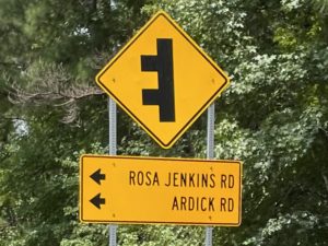
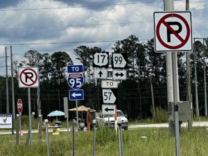
In which Doris muses on the language of road signs.
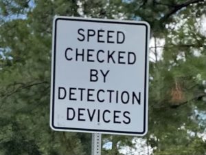
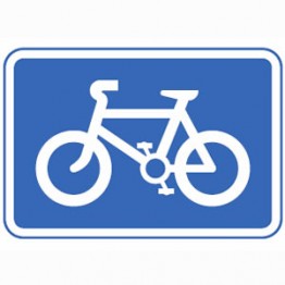
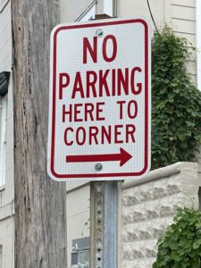
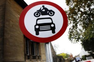
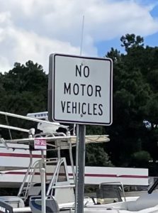
You can’t drive in America for long (if you are from somewhere else) without remarking on the way that road signs are full of words. In the UK and Europe we favour pictograms, and in fact we will go to almost any length to AVOID having words on road signs, but in the US a word is worth a thousand pictures.
After a busy few days taking photos of signs, Doris found this illuminating article on Wikipedia. It explains:
“There are no plans for adopting the Vienna Convention on Road Signs and Signals standards. The 1971 MUTCD adopted several Vienna Convention-inspired symbol signs with the intent to transition to symbols in lieu of words as “rapidly as possible”, but U.S. drivers were baffled by symbol signs. The language about “rapidly” transitioning to symbols quietly disappeared in the 1978 MUTCD.”
The net result is that American road signs appear to be written for literate amnesiacs, while European ones are for people who can’t read words but have mysteriously mastered the arcane grammar of approved ideograms.
So I ask you, gentle reader(s), please adopt the manner of a long-suffering optician, and ask repeatedly, which is clearer? This? Or This?
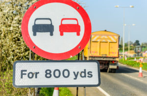
Although sometimes a bit of extra thought may be needed:
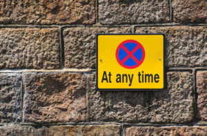
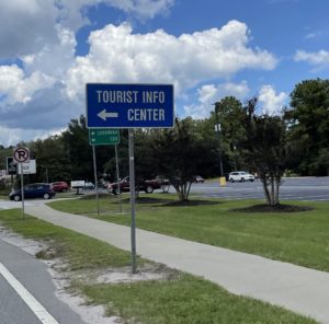
And of course, once you allow words on signs you can actually be helpful:
…as long as you don’t overdo it.


