HELLO WORLD!!!!
I am writing to anyone who cares about mapping to ask you to try and improve the quality of electronic maps.The fundamental problem is that Mr Google etc all believe that roads should be represented at their true width. This means that most roads are shown microscopically small, in fact you can’t see many of them until you are zoomed right in at which point you can’t seen anything else useful like where you want to go or what the choices of road are.
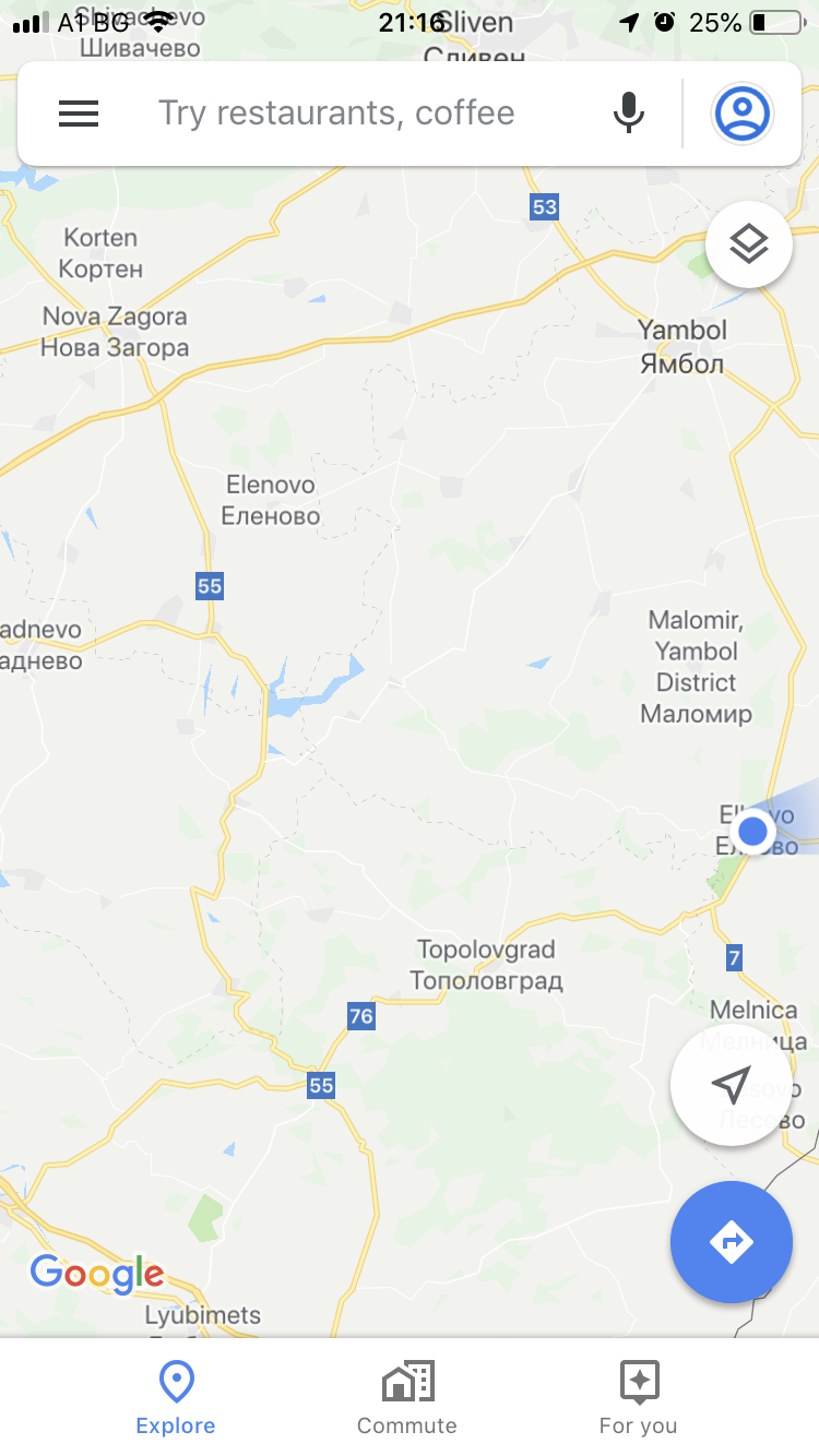
Look at these two perfect illustrations.

On the left is a picture of the paper map that we bought in Bulgaria. It’s got all the roads on that actually usefully exist, and they are colour coded so you can immediately see which ones are likely to have lots of traffic. I photographed this in a fairly rotten light level on my hotel bed. Deep purple are the single-digit “A” roads (UK system) – busy roads to avoid, light purple are double-digit A roads that you might want to risk, yellow are B roads which in Bulgaria will be wide and empty, white roads are local roads which will be narrow and empty. A cyclist’s friend, and the whole of Bulgaria on one sheet of paper.
On the right is the disaster that is Google Maps, zoomed out to cover the same area. This shows you 100% of what you can see on the phone. It has some yellow wiggles. It does actually have all the same information and detail, but it won’t show it at this level of zoom. (If you have very keen eyes you will see that it also has a new motorway near the top (below Nova Zagora and above Yambol) which is missing from the 2011-dated paper map.)
So please will someone volunteer to present the Google Maps information intelligently? I will start the crowd-funding.