Or, “is that brush stroke really necessary?”
As Sid and Doris travelled illiterately through Japan, they became aware that, just like the Roman alphabet, Japanese letters can be written in different styles. In this poster there is some simple information at the top, with a much more formal sign-off from the City of Kyoto at the bottom.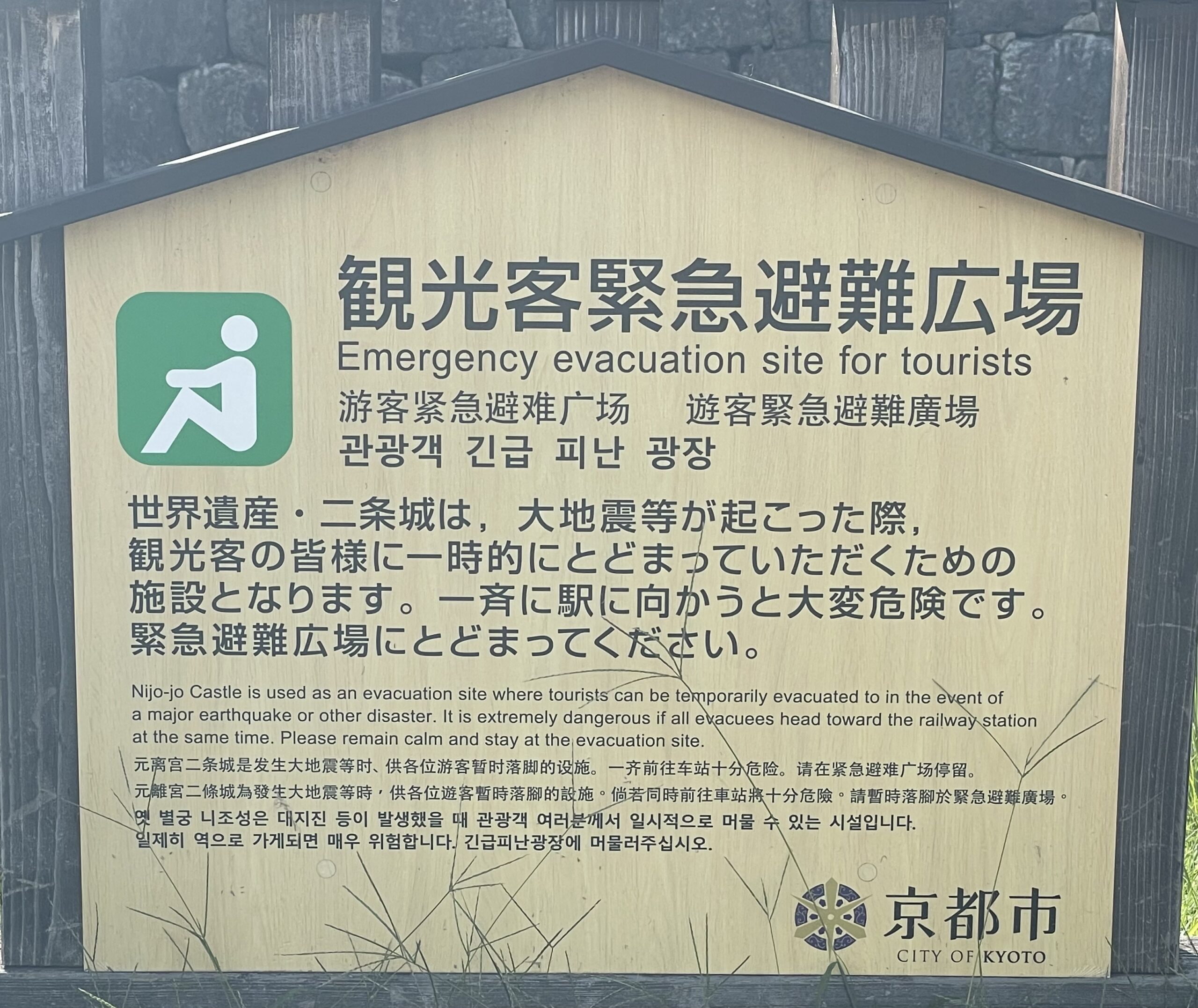
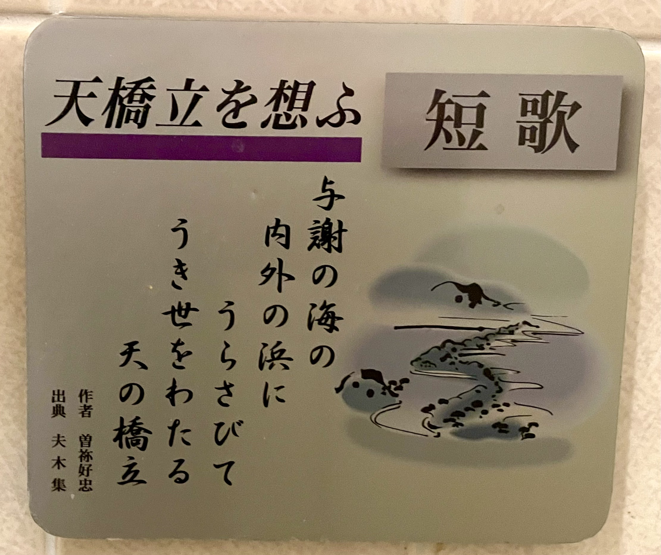
This plaque explaining the dragon sea-bridge has very accentuated serifs on the top letters, and freer-form brush letters for the actual poem.
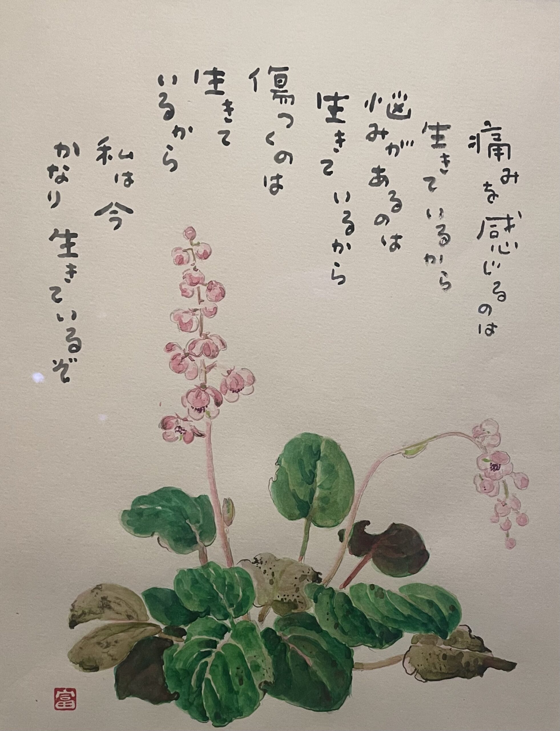
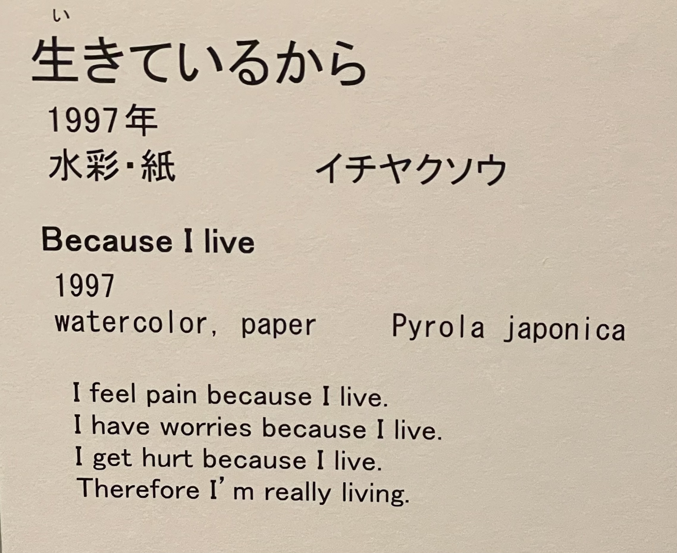
A set of illustrated poems by a man who was quadraplegic and held the brush in his mouth were translated for foreigners, but did not need to be typed out for Japanese readers.
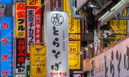
And loud shouty signs can look extremely simplified.
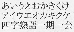
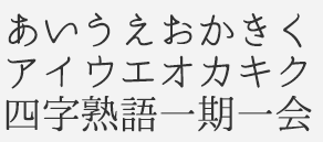
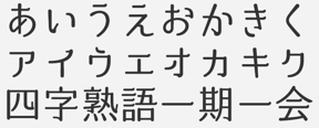
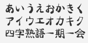
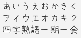
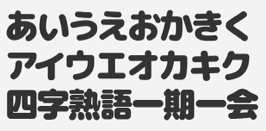
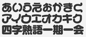
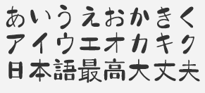
So with many thanks to the site www.freejapanesefont.com, here are some examples of different Japanese fonts, each one showing the same letters. It’s fun to see how the letters morph, and if you go to the web site you can also see Roman letters in the same style below each one.
OK I guess as Random posts go, this one was particularly random.